The in|sure PSLife life insurance policy management system is already looking back at a 10-year history of productive use. During this time, it has been enhanced with new specialized and technical functionalities, and the technology stack has also been continuously updated.
Although in the past there were smaller improvements in its operation and updates to the technological basis with respect to the user interface, there were no fundamental changes to the Graphical User Interface (GUI) basic user guidance and structure.
At the same time, over the last 10 years there have been many other developments with respect to user-friendliness and software system user guidance (user experience, or UX for short), and new options have emerged with respect to the graphic user interface, which our existing system should also benefit from. Especially since more recent in|sure Ecosphere systems are already using cutting-edge GUI-concepts, which in recent years has resulted in the new and consistent look & feel that the in|sure Ecosphere was developed for.
However, such a major undertaking with a direct impact on all of the system’s users requires a well-planned, long-term preparation. For this reason, the first discussions about the idea of a thorough update of the in|sure PSLife’s GUI took place more than three years ago.
From the idea to implementation
During the Fall 2018 in|sure PSLife Partnership Forum, we introduced the so-called GUI initiatives to our customers for the first time. A “usability” working group was then established with the help of customer representatives. This was followed by regular meetings with presentations of design proposals (low-fidelity prototypes) and click dummies (high-fidelity prototypes), which repeatedly involved discussions with actual specialists. At the same time, contextual interviews were conducted during which the actual, regular work was observed and documented by a UX expert. Furthermore, a kano survey (special questioning technique for discovering customer needs and wishes) was carried out, during which 23 GUI requirements had to be marked as “functional” (how beneficial is a requirement) and “dysfunctional” (how detrimental is the absence of a requirement).
Parallel to this, a state-of-the-art look & feel for the graphic components was designed and implemented within adesso insurance solutions. This offered the in|sure Ecosphere systems an alternative to the classic look & feel that users had been familiar with up until now.
Two years after the initial introduction of the GUI initiatives, a final preliminary design of the new look & feel could be presented in the Fall 2020 Partnership Forum, and the deployment of the new GUI for in|sure PSLife could then be decided on for the coming spring release.
Challenges during the implementation
Over the following eight months, all of the until-now existing GUI’s (well over 100 technical template components) were adapted to the new look & feel. At the same time, thorough changes were implemented in the template structure, presentation formats for specific dates and the user guidance. This occurred parallel to the customary continued development and implementation of new specialized functions as part of a standard release development.
The biggest challenge during the entire redevelopment of the GUI was to always maintain a testable version of the entire system in order to ensure the quality of the software during the new release’s development. An important pillar for this was our internal quality assurance regression test that occurred daily and in large part took the form of an automated GUI test.
As a result, it quickly became clear that the “old” GUI had to be preserved and remain operable in order to be able to continue using the automated GUI test and to secure the option for manual tests during the ongoing development of the release. The new GUI was usable during the first months of redevelopment, though only with very limited functions. This was because not all of the components necessary for the basic use of the system had been implemented.
Parallel to the completion of new template components, the automated GUI tests were gradually adapted to the new templates in order to also ensure the latter’s quality. For this, one had to adapt more than 100 automated regression test cases.
In addition to these automated tests, continuous comprehensive, manual tests of the complete GUI components took place. Along with ensuring the functionality of the templates, there was always a special focus on the GUI’s user-friendliness and consistency.
Accompanying the implementation and testing of the new user interfaces were regular weekly sessions for presenting, assessing, and discussing new GUI designs and completed templates.
The mammoth project was finished at the end of April 2021, and the release including the new GUI could be made available to our customers.
In order to ensure the greatest possible acceptance of the new GUI among our existing customers, the completed templates were already being introduced during development. Furthermore, a central demo system with an advanced stage of development was made available in order to enable one to become familiar ahead of time with the new templates that the future user would be utilizing.
The actual technical integration of the templates into the customer projects was facilitated by the development of a two-stage release-upgrade process. To this end, the temporary preservation of the old GUI was an important building block:
Step 1: Conducting a “normal standard release upgrade” using the old GUI
In particular, this also enabled the execution of existing customer regression tests and thus the quality assurance for the first stage.
Step 2: Integration of the new GUI, including the adaptation to customer-specific GUI adjustments and upgrades
If necessary, this was led by an experienced GUI developer from the GUI Product Development Team.
Positive feedback as a reward
After some challenging work, both for the internal product development and for our customers with respect to their adopting the release and its adjustment to their customer-specific template upgrades, the new GUI is now being used by all productive customers. It is receiving lots of positive feedback:
“Adapting the GUI not only improved the use of the interface; potential error sources have since then been reduced as much as possible.” (Samuel Butterwick, Contract Division, head of contract team, Barmenia Lebensversicherung a.G.).
“In addition to the new, very appealing, neatly-arranged template layout, I am the most excited about the error reporting components and the subdivision of the arrangements into optional and mandatory-step templates. These new features both save time and minimize the potential for errors.”
(Pascal Maierfels, expert on industry-related tasks, Munich Association of Insurance Groups)
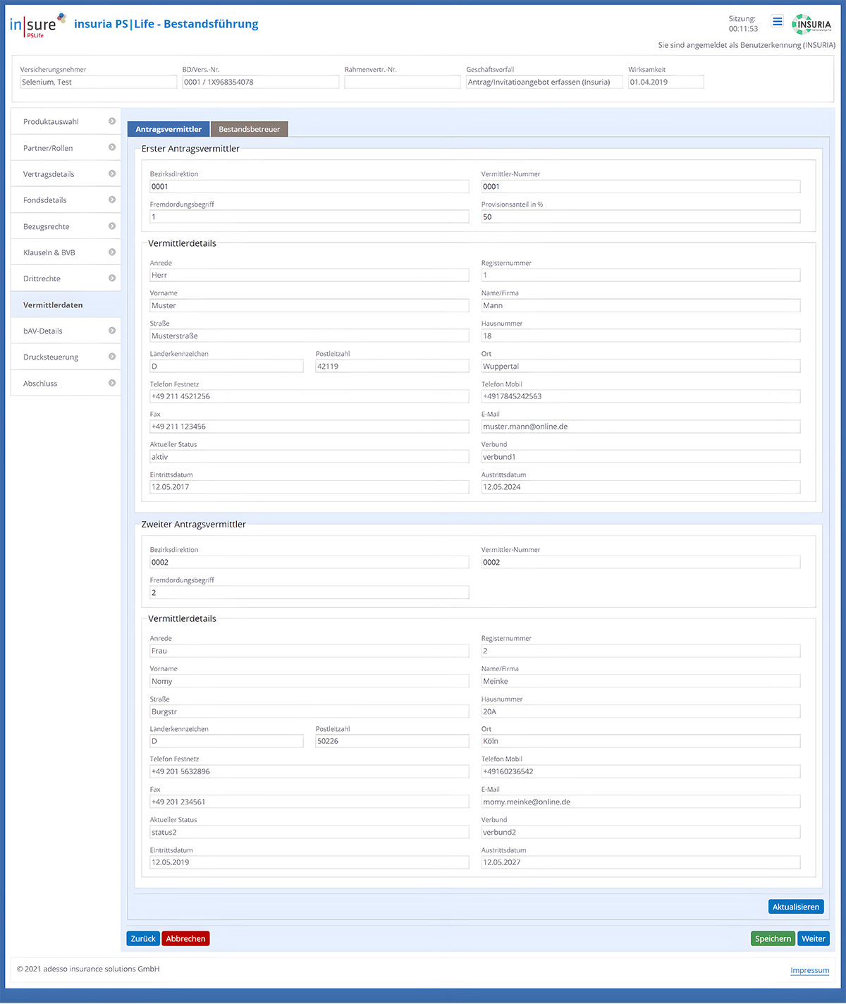
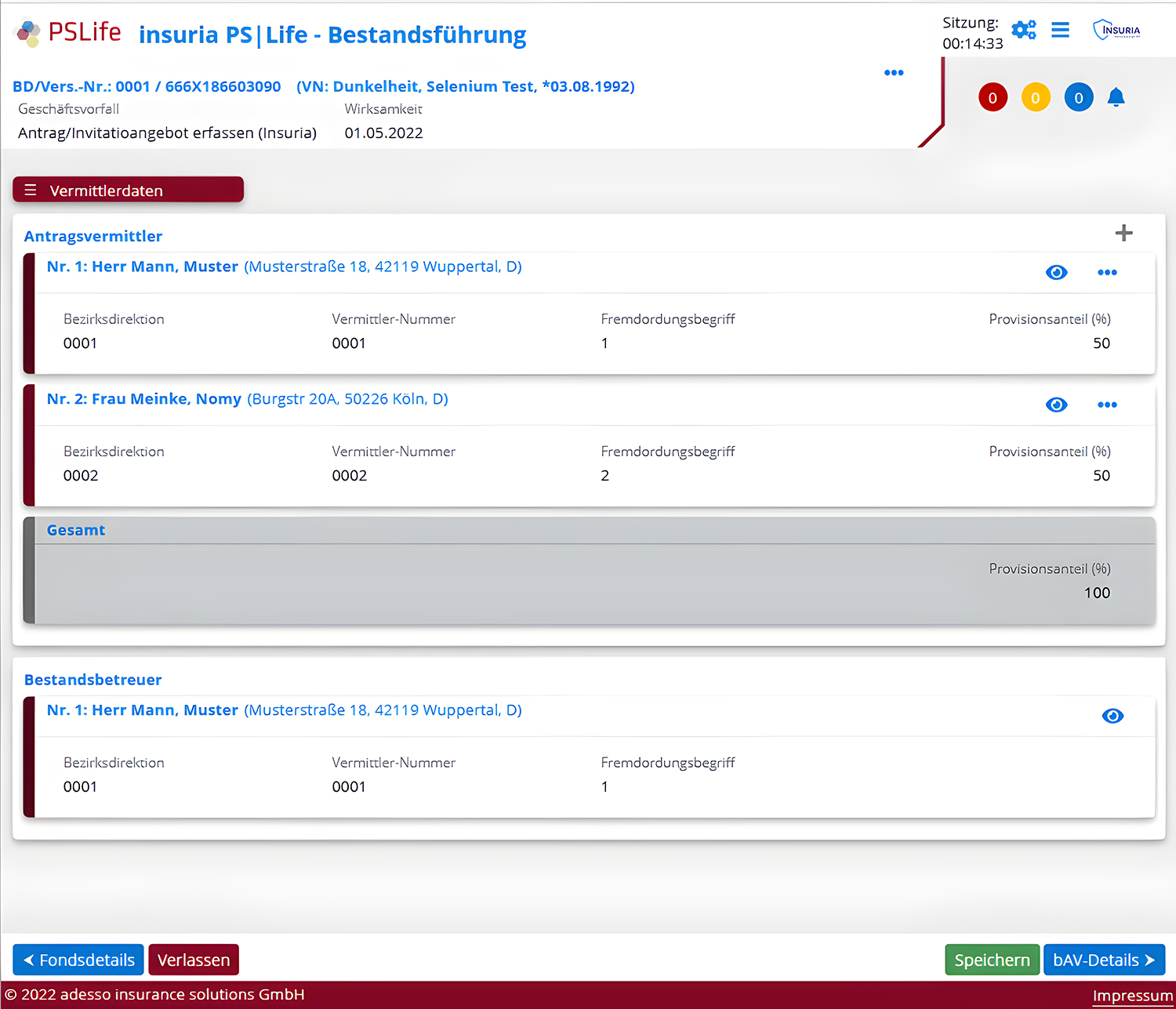
If you're curious, here's a sample image of in|sure PSLife before the relaunch and after the GUI makeover was done.

Do you have any questions or comments? Then please leave us a comment.